
A logo redesign for Scott-Grant
Updating a logo for multiple uses
The old Scott-Grant logo had been in use for some considerable time. It was difficult to place on a page and to try and accommodate it a little better I had resorted to placing it in a tint box. Looking back now it seems strange a logo redesign didn’t happen sooner.
It was during the Scott-Grant company website design project that the subject of updating the logo was first discussed. A simplified square logo was tried and definitely looked cleaner and more modern. That’s when the logo redesign started in earnest.
The old Scott-Grant logo
A logo redesign fit for purpose
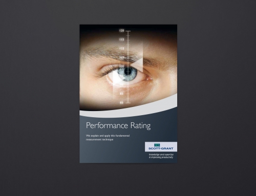
A first round of creative proposals ranged from a simple refresh up to designs that really were quite different. The most recent corporate branding I’ve produced for Scott-Grant features and upward curve graphic. This upward curve graphic represents the increase in productivity that Scott-Grant are specialists at delivering.
The chosen logo features the capital ‘S’ and ‘G’ overlapping each other as per the old logo. These two combined letters are then positioned over the upward curve graphic line which separates the blue and green halves of the square background. Keyline weights were explored to make sure that the logo would scale from small up to very large. Rounded corners were added to soften the appearance.
A number of fonts and weights were tried to keep the logo clean and scaleable.
Adapting the logo for different uses
Scott-Grant provide people to improve productivity in the workplace and also offer a comprehensive training course programme. This means that the logo would need to be used in a wide range of applications. This could be anything from single colour solid versions on time sheets to embroidered line versions on satchels as well as full colour digital and print uses. A further set of requirements required the logo to be designed so that it could be reversed out of heavy dark backgrounds.
So far the logo has been rolled out with great success. Perhaps measure of this success is how the old logo that once seemed quite acceptable now looks completely out of place!
The new Scott-Grant logo on a display panel
Branded letter headed note paper and a report cover
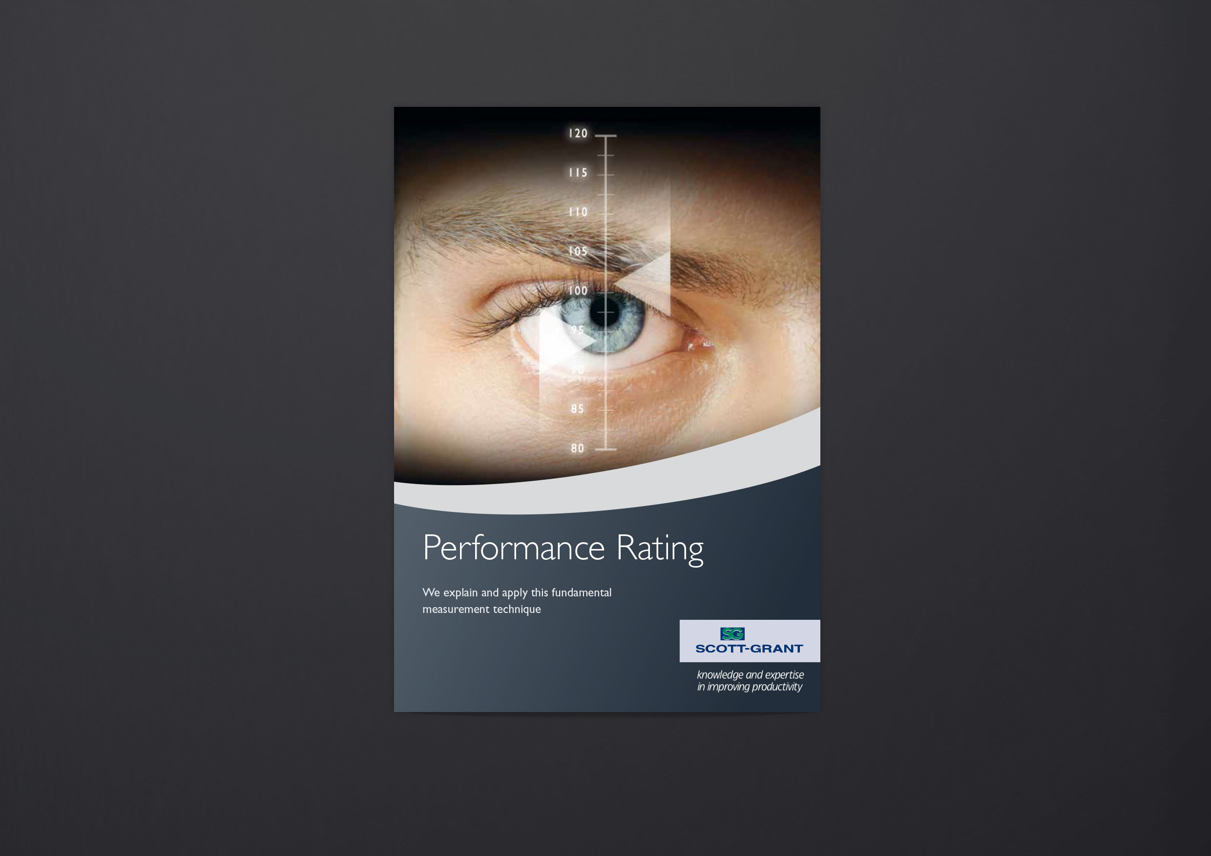
Logo reversed out of a dark blue background on a training manual
“A quick feedback Ian to say that I am very pleased with our new logo as we steadily roll it out.
It has definitely moved us forward and whether colour or mono, whatever application, it has added a great deal of presence and value to our communications and I feel very proud of it.
Thanks for your designs and patience as we deliberated, it really is worth the effort.”